8 Google Font Pairings That Make You Look Like A Pro
Although a talented and reliable designer is a crucial investment for your business, we understand that most emerging entrepreneurs can’t afford one right away. That is why we’ve compiled a list of 8 Google font pairings that you can use in the meantime to create clean and professional-looking content.
To download the full font catalog, click here.

1. Oswald + EB Garamond
This classic font pairing is perfect for brands that want to evoke a sense of historical resonance and timelessness. The approachable heading breaks up the stoic body font.
Keywords –
Classic, refined, sophisticated, traditional, elevated, elegant, understated
Downloads –
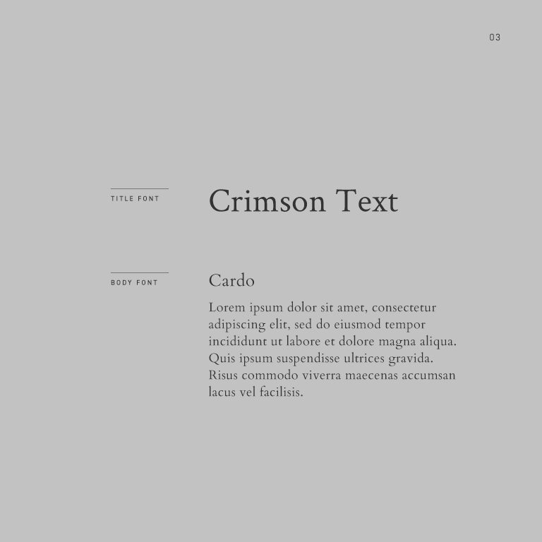
3. Crimson Text + Cardo
This refined font pairing is perfect for brands that want to offer a rich and elevated visual experience. Though mixing serif fonts can be tricky, the heavier stroke on the heading beautifully balances the delicate nature of the body text.
Keywords –
Aspirational, luxurious, elevated, delicate, elegant, sophisticated, refined
Downloads –


5. Playfair Display + Karla
This attention-grabbing font pairing is perfect for brands that want to evoke a sense of elegance and playfulness. The whimsical heading counterbalances the understated nature of the body text.
Keywords –
Fancy, whimsical, playful, inviting, elegant, approachable, fun, care-free
Downloads –

6. Julius Sans One + Crimson Text
This refreshingly clean font pairing is perfect for brands that want to evoke a sense of minimalism while still maintaining some character. The charismatic header font counterbalances the stoic nature of the body text.
Keywords –
Curvy, approachable, clean, elegant, refined
Downloads –

7. Quattrocento + Fanwood Text
This aspirational font pairing is perfect for brands that want to evoke a sense of luxury and hospitality. Though mixing serifs can be tricky, the rounded, character-filled header font stands out beautifully from the subdued body text.
Keywords –
Refined, elevated, luxurious, timeless, historical
Downloads –

8. Work Sans + Lato
This clean font pairing is perfect for brands that want to offer a polished, pragmatic visual experience. Though mixing sans-serif fonts can be tricky, the subtle curvatures and heavier stroke in the header font help differentiate it from the body font.
Keywords –
Clean, pragmatic, modern, sleek, practical
Downloads –

Want to see the full font catalog?
Download our PDF booklet which includes 100+ designer-approved header and body font pairings carefully curated by our team here at The Denizen Co. Each font can be downloaded via Google Fonts or Typekit so you can implement the fonts right away and get a head-start on branding your business.