8 Squarespace Font Pairings For Wellness Brands
Starting a wellness brand but don’t know what fonts are right for you? While many companies centered on self-care and mindful practices have similar branding protocols, it can be challenging to find font pairings that speak to your particular brand. Today, we will introduce 8 distinct Squarespace font pairings that are perfect for brands in the health and wellness industries.
Want to see our full font catalog? Click here.

1. Freight Neo Pro + Lato
This polished yet soft sans-serif font pairing is perfect for those who want to evoke a clean yet inviting brand presence. Both fonts have a similar profile, but the slight contrast on the title font differentiates it from the body font. This balanced pairing reads the best when the title font is in all caps.
Keywords –
Clean
Minimal
Soft
Inviting
Honest
Trustworthy

2. Orpheus Pro + Cormorant Garamond
This sophisticated yet approachable serif font pairing is perfect for those who want to convey a high-end and timeless brand presence. The stoic nature of the title font is counterbalanced by the curly nature of the body font. This sophisticated pairing reads the best when the title font is much larger than the body font.
Keywords –
Elegant
Traditional
Classic
Timeless
Sophisticated
Refined

3. Questrial + Muli
This clean and structured font pairing is perfect for those who want to evoke a sleek and minimal brand presence. While the title font is uniform and linear, the body font features slight curvatures that keep the overall presence warm and inviting. This font pairing reads the best when the title font is in all caps and the body font has a lighter weight.
Keywords –
Clean
Structured
Modern
Trustworthy
Honest
Friendly
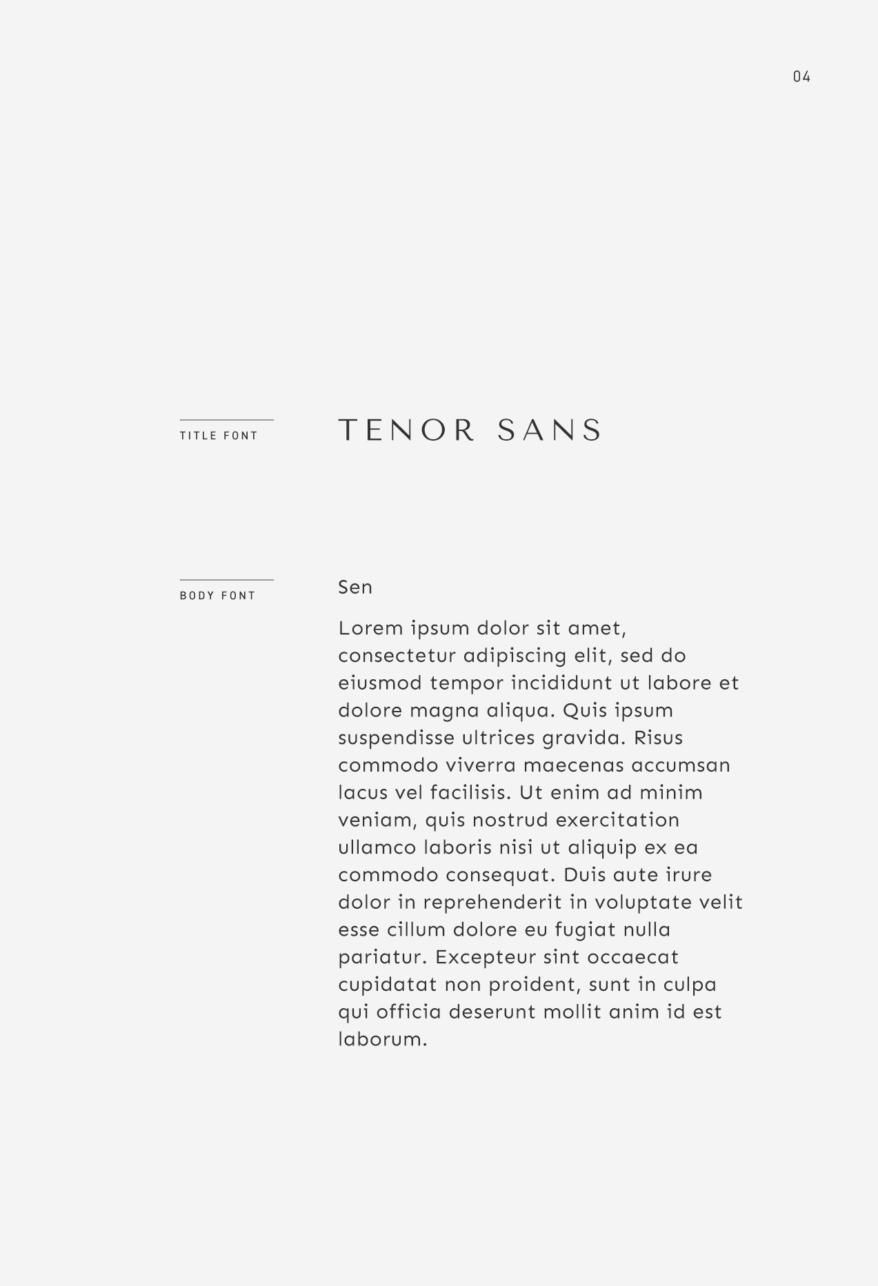
4. Tenor Sans + Sen
This round and friendly sans-serif font pairing is perfect for those who want to convey a tidy yet approachable brand presence. Both fonts features curvy tails but the slight contrast in the title font differentiates it from the body font. This whimsical font pairing reads the best when the title font is in all caps and the body font has a lighter weight.
Keywords –
Playful
Whimsical
Friendly
Tidy
Inviting
Feminine

5. Poppins + Futura
This clean and structured font pairing is perfect for those who want to evoke a sleek and modern brand presence. The linear nature of the body font is counter-balanced by the slight curvatures and overall roundness of the title font. This font pairing reads best when the title font has a thicker weight than the body font.
Keywords –
Clean
Structured
Modern
Futuristic
Sleek
Innovative

6. Optima + Neue Haas Grotesk Display
This polished sans-serif font pairing is perfect for those who want to convey both a classic and modern brand presence at the same time. The title font reads clean and forward-thinking while the body font is a timeless and ubiquitous font. This font pairing reads best when the title font is much larger than the body font.
Keywords –
Classic
Modern
Timeless
Structured
Established
Trustworthy

7. Filson Pro + Lora
This lighthearted serif vs. sans-serif font pairing is perfect for those who prefer a bold title font that exudes character. The low baselines and curly tails of the title font is counter-balanced by the grounded serif body font. This font pairing reads the best when the title font is in all caps and has a thicker weight than the body font.
Keywords –
Inviting
Whimsical
Grounded
Friendly
Unique
Lighthearted

8. Aviano Flare + Helvetica Neue
This high contrast font pairing is perfect for those who want to convey a modern and fashion-forward brand presence. The pronounced width and curly tails of the title font is grounded by the clean and neutral body font. The title font is best displayed in a much larger size than the body font with slightly increased letter spacing to give each letter room to breathe.
Keywords –
Eclectic
Fashion-forward
Expressive
Modern
Creative
Unique

Want to see the full font catalog?
Download our PDF booklet which includes 100+ designer-approved header and body font pairings carefully curated by our team here at The Denizen Co. Each font can be downloaded via Google Fonts or Typekit so you can implement the fonts right away and get a head-start on branding your business.