How To Choose A Font For Your Logo: The Definitive Guide
This is the ultimate guide to choosing the perfect font for your logo.
In this comprehensive guide, you will learn about:
The difference between a logotype and logomark
Key font types and what they say about your brand
Font style variations like weight, style, and width
How to use font pairings for your logo
If you are interested in our customizable logos or are planning on DIY-ing your own logo, read on to learn how to pick the perfect font for your business.
Let’s get started.
Table of Contents
Chapter 1
Choosing Between a Logotype and Logomark

Chapter 2
Font Types and Their Brand Associations
Chapter 3
Font Weight, Style and Width
Chapter 4
Pairing Fonts For Your Logo
Chapter 1: Choosing Between a Logotype and Logomark
In this chapter, we will discuss the difference between a logotype and logomark, and the pros and cons of each.
By the end of this chapter, you will understand which logo format serves your brand better.
Logo formats can be divided into two categories: logotypes or logomarks. Here’s what makes them different:
Logotype
A logo that features text, and usually displays the company name in full. Examples: Aesop, Oak + Fort, Verishop
Pros: ideal for brand awareness and name recognition
Cons: risk of becoming outdated as font trends change over timeLogotypes are recommended for:
newly established brands that want people to learn their name
brands with taglines or names that reveal what type of products or services they offer
Logomark
A logo that features an icon or graphic instead of text.
Examples: Apple, Lululemon, EndelPros: can be highly customized and unique
Cons: will take longer for people to learn your company name and will likely require professional design helpLogomarks are recommended for:
brands that offer products or services that are unfamiliar or cannot be described in a few words
brands that need to display in small areas, like tech, apparel or apps
In other words: if you are a newly established brand that prioritizes brand recognition, you would benefit from a logotype. If you are a brand introducing a new and unfamiliar product or service – like soundscapes, in Endel’s case – you may benefit from a logomark.
If you have decided to proceed with a logotype, read on. If you have decided to proceed with a logomark, you may need some extra help. Consult a graphic designer or try our Full Branding Package.
Chapter 2: Font Types and Their Brand Associations
In this chapter, we will cover the six fundamental font types. Then, we will discuss what brand association – or “feeling” – each font type evokes.
By the end of this chapter, you will know what font type best represents your brand.
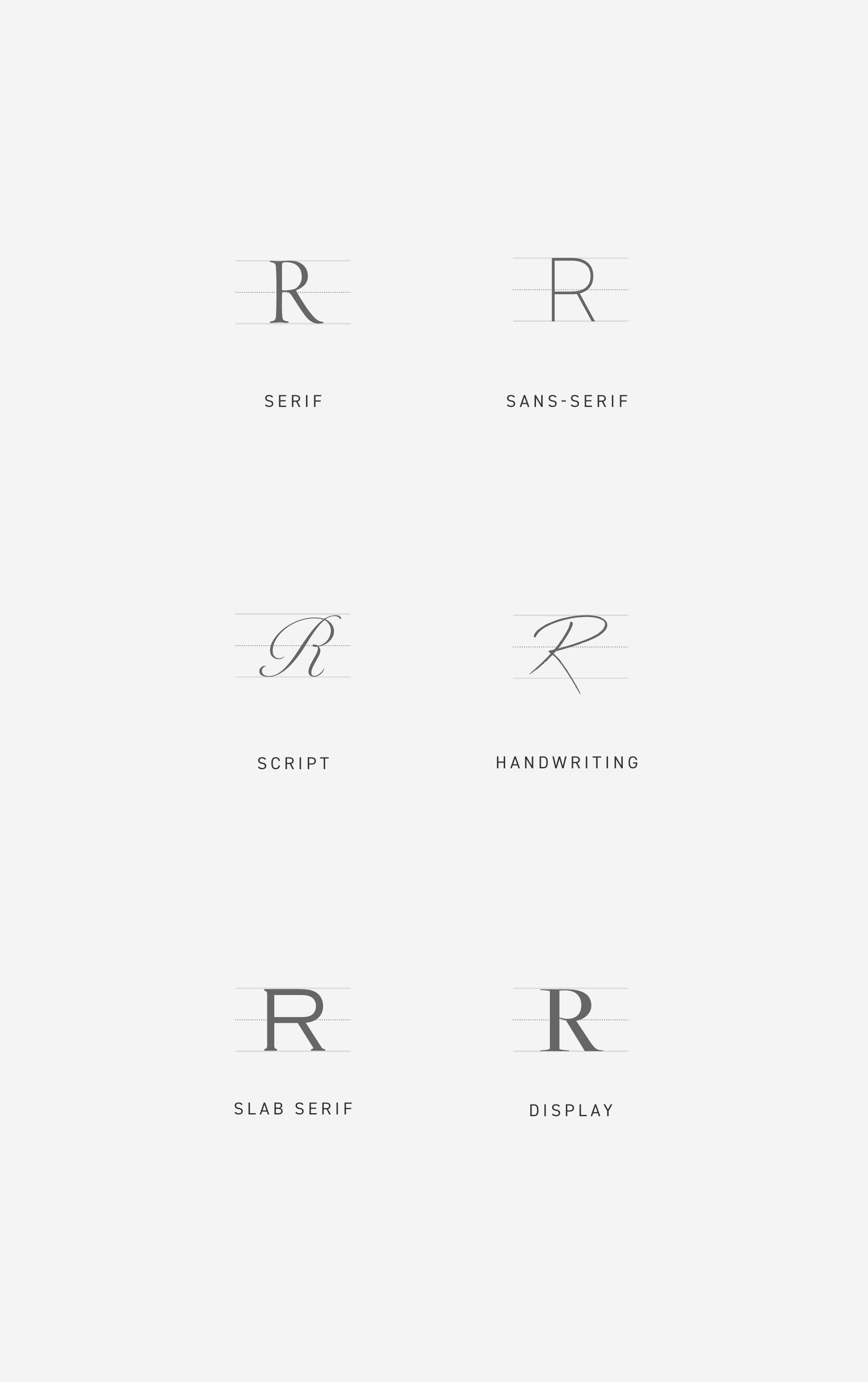
Choosing a font from the vast array of fonts out there can feel overwhelming. Thankfully, we can break fonts down into six categories to narrow down your font choices. Below are the main font types:
Serif
Fonts that feature short strokes at the end of each line
Moods: classic, refined, trustworthy, traditionalSans-Serif
Fonts that do not feature short strokes at the end of each line
Moods: airy, modern, clean, geometric, linear, minimalistScript
Fonts that are characterized by the varied strokes of calligraphy
Moods: opulent, feminine, ornate, elegantHandwriting
Fonts that are characterized by the organic strokes of handwriting
Moods: organic, natural, approachableSlab Serif
Fonts that are characterized by thick, block-like serifs
Moods: earnest, masculine, authoritativeDisplay
Fonts that are specifically designed for large headings
Moods: unique, eclectic, quirky, unusual
Choose the font type that embodies the keywords that you would like potential customers to associate with your brand.
For example, if you would like your audience to characterize you as a modern tech-brand with a minimalist edge, you would likely choose a sans-serif font. On the contrary, if you are starting a traditional leather goods company that specializes in classic shapes and silhouettes, you would likely choose a serif font.
Got a font type in mind? Let’s continue.
Chapter 3: Font Weight, Style and Width
In this chapter, we will cover the stylistic variations that can help narrow down your font choices even further.
By the end of this chapter, you will have a final font candidate that resonates with your brand.
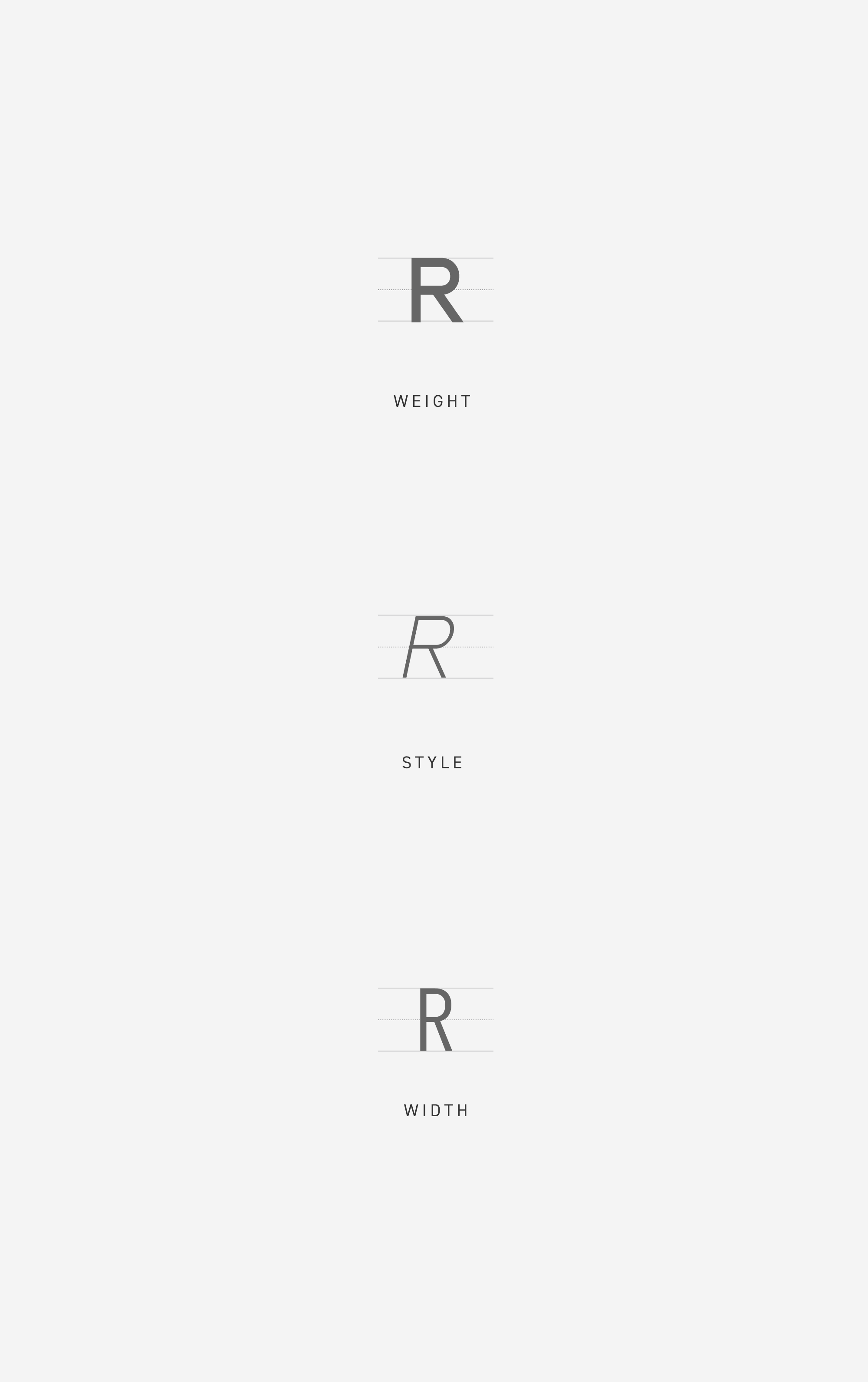
Now that you have a font type in mind, you can refine your search further by determining what style variations you prefer. Below are three style variations to look out for:
Weight
While some fonts are thick and robust, others are hair-thin and delicate. This depends on the font’s weight or the thickness of its strokes. Thicker fonts usually read as loud and assertive, while thinner fonts usually read as subtle and refined.
Style
Most fonts come in two styles: normal or italic. The italic variation of a font is slanted or oblique and is noticeably different from its normal variation. Depending on the font, a normal variation may read as traditional and grounded, while an italic variation may read as dynamic and whimsical.
Width
While some fonts are wide and stout, others are tight and condensed. This depends on the font’s width, or the distance between its left and right edge. Wider fonts usually read as established and masculine, whereas narrower fonts usually read as modern and aspirational.
Choose a style variation that embodies the keywords that you would like potential customers to associate with your brand.
For example, if you would like your audience to characterize your brand as a refined jewelry brand with a modern edge, you would likely choose a serif font with a thin weight and narrow width. On the contrary, if you are founding a masculine furniture company that specializes in traditional designs and materials, you would likely choose a serif font with a normal style and wide width.
Now, use the search filters on Google Fonts and Adobe Fonts to find a font that resonates with your brand.
Chapter 4: Pairing Fonts in Your Logo
In this chapter, we will discuss how to combine your logo font with another font to add taglines without disrupting the balance of the logo.
By the end of this chapter, you will know what primary and secondary fonts to use for your logo.
If your logo includes a tagline – like the services you offer or an establishment year – you will likely need to choose a second font that pairs nicely with your first. Keep the following in mind when searching for your secondary font:
Maintain visual hierarchy.
In other words, your secondary font should not outshine your primary font. Make sure your company name remains the most prominent element in your logo by choosing a second font candidate that is smaller, perhaps thinner and less distinctive than your first font candidate.
No more than two fonts.
It becomes increasingly difficult to maintain visual hierarchy when you have more than two kinds of fonts. Keep it simple.
Secondary font must be legible.
Think of your primary font as the distinct and charismatic lead role and your secondary font as the logical and straight-laced supporting actor. Infuse as much character as you can into your primary font, but make sure that your secondary font is legible and easy on the eyes.
Mix and match.
Your primary and secondary fonts don’t necessarily have to come from the same font family. You can mix and match different font types, weights, styles and even widths, as long as they evoke the same brand association.
Want to take the guesswork out of choosing the right font pairing?
Was this helpful?
Here at The Denizen Co., we offer branding tools for every stage of your business. Did this article point you in the right direction? Great. If you are still unsure of how to proceed, take a look at some of our resources below:
